Joseph Kaye Guitars
Case Study: Joseph Kaye Guitars
Included: Squarespace website design, photography, copywriting, and SEO
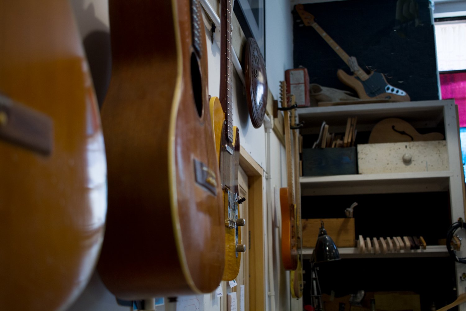
Did you know that someone who makes guitars is called a luthier? It’s Latin for ‘lute maker’ but has now become the well-known term for anyone who makes stringed instruments. Joe Dobson is yet to make a lute, but I doubt he never will as he seems to be one of those people who is great at whatever they turn their hand to.
I first met Joe when my drum machine broke and needed a quick fix before a gig. My husband Matt and I brought it over to Joe’s workshop in North East London where I learned that Matt had plugged the Japanese cable into the UK plug socket - a detail he had previously failed to mention.
Nevertheless, the problem was fixed speedy quick by the hero that is Joe Dobson.
For me, this was a dream job and I immediately set out to interview Joe for the copy of the website.
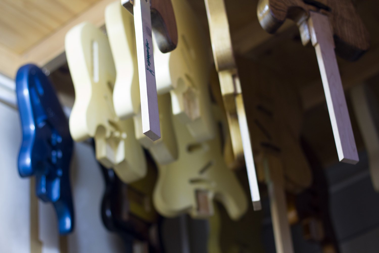
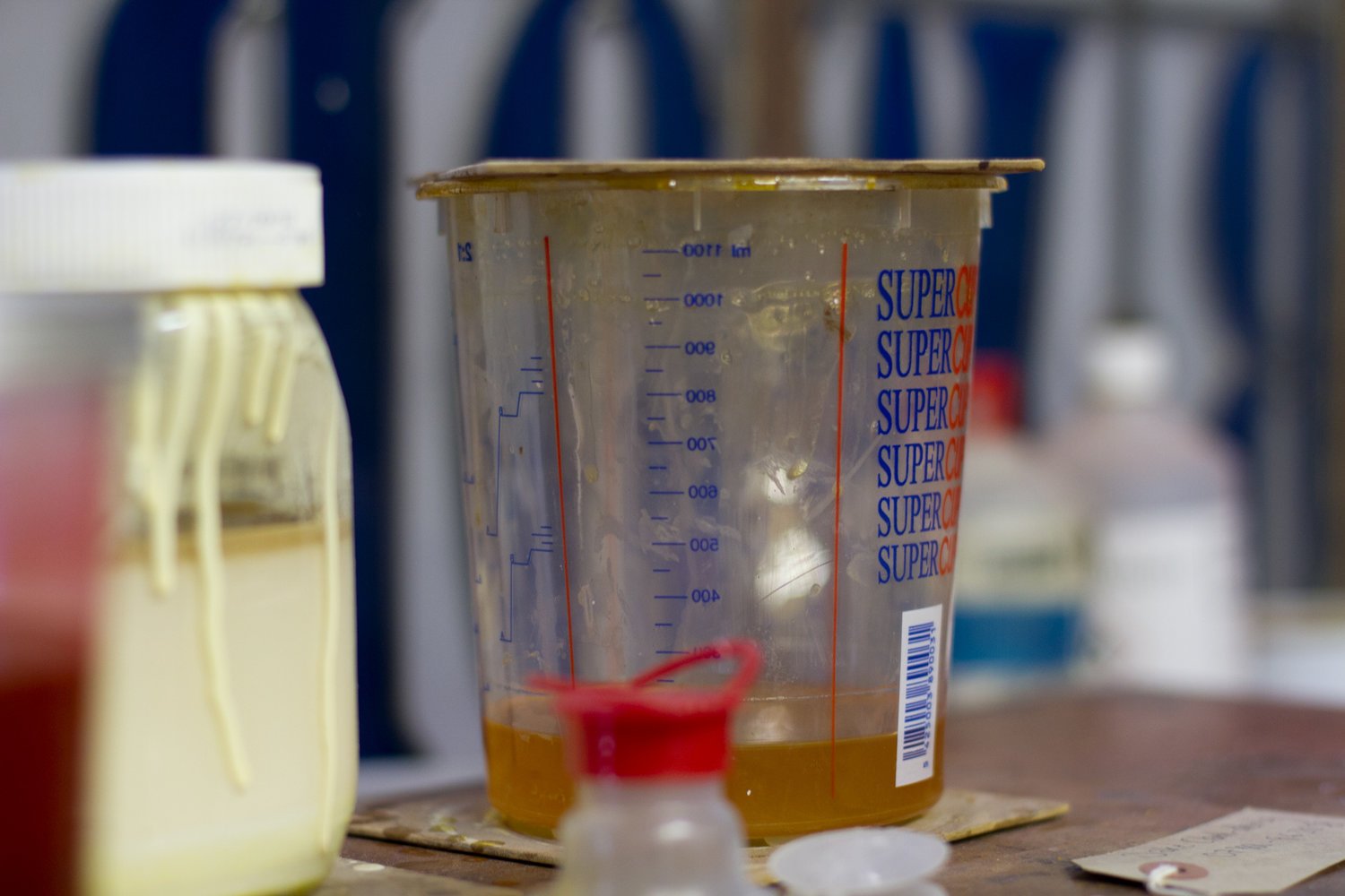
I wanted to know which keywords Joe would like his site to rank for, which prompted a lesson in traditional guitar-building techniques. I learned about the binding qualities of hide glue, how Joe was first recognised for his use of nitrocellulose lacquer and that he hand winds all of his pick-ups.
Before our meeting, I had gone through his website to get an understanding of what he does, yet I hadn’t read anything about the process. For example, I had no idea that Joe uses, when he can find it, Victorian wood he finds in skips across London. The reason he does so, apart from it being more economically and environmentally friendly, is because it is the exact age of the pine wood used in the early Gibson prototype guitars. Knowing that I would be the first to share it with the world wide web was an exciting prospect.
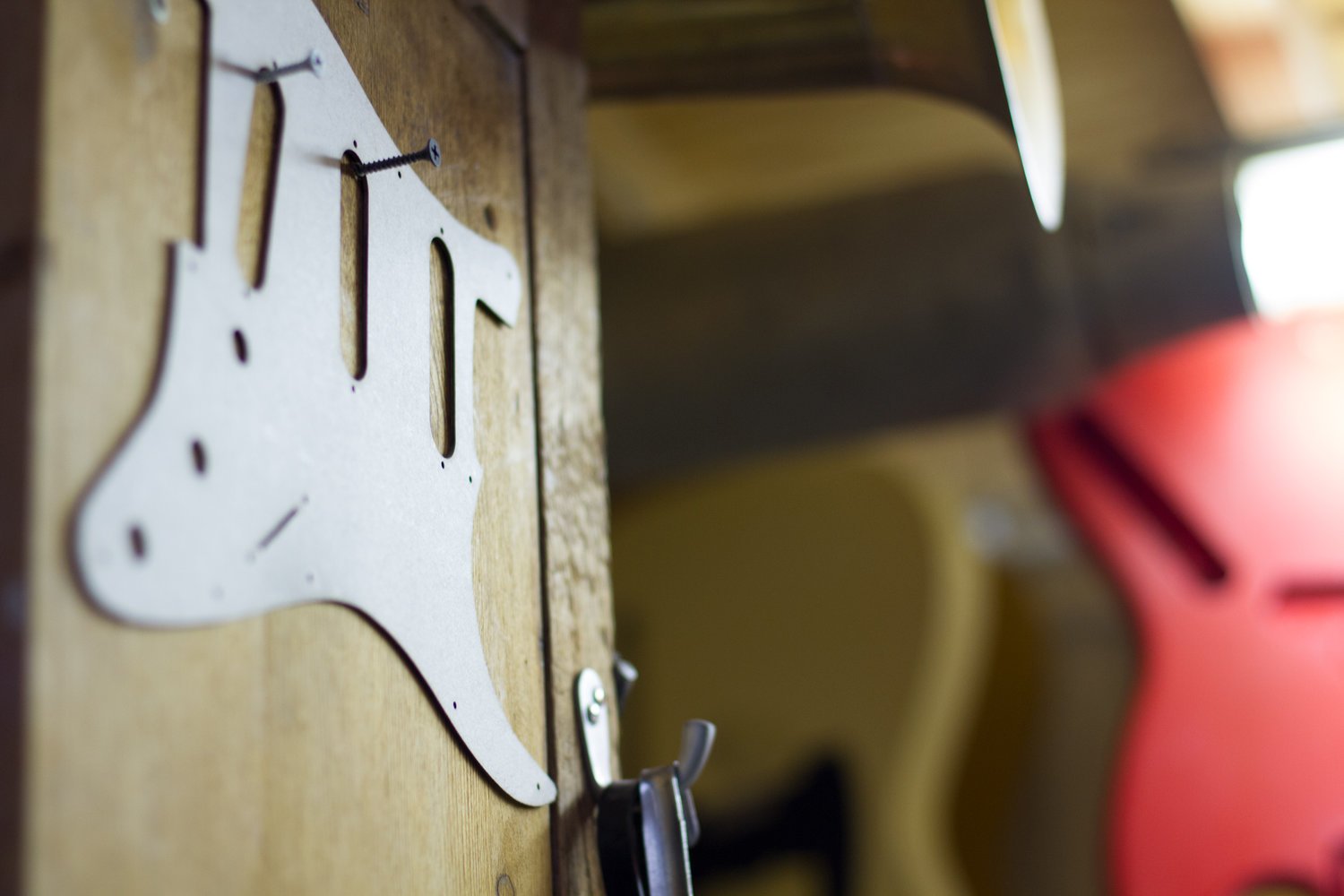
In our meeting, I discovered that the most unique and important part of his business is the process, so decided to make a page dedicated to that.
Using the photos I had taken in our first meeting, as well as photos taken from his Facebook page, I built a very visual website due to the nature of the business. On his previous website, he had a photo gallery of projects that he wanted to keep and update regularly, but when I saw that he was already very on top of his Instagram business profile, I suggested that we link it to the site so that photos are automatically uploaded.
The rest of the site was relatively straightforward, designed to have a retro feel that displayed all the necessary information for Joe’s prospective clients. I am (and I hope Joe is as well) extremely pleased with the outcome and look of his new website. We received some amazing feedback, my favourite being:
That's a great site, Joe. Says everything it needs to and nothing that it doesn't - kind of intimate, too. Also, my pedant's radar didn't twitch at all - good job.
If this story sounds like you and you would like to update your website, please don’t hesitate to get in touch!


